When things are at their worst, when the world is in crisis, one might wonder whether changing your brand is a little like rearranging the deckchairs on the Titanic. Does it really matter whether your website is blue, yellow, or pink polka dots, when children lie neglected and abused in orphanages, or running for their lives fleeing war?
I would argue, that for a charity like us, that is when knowing who you are, and being able to articulate that clearly to the world, matters most.
When I arrived at Hope and Homes for Children, a little over a year ago, I love, love, loved the cause. How could I not, with three young children of my own? The idea that I could help children just like mine have a life of love, in a safe family, was captivating. Luckily, the organisation was keen to go on a journey of discovery about how it might communicate more effectively and had given us a mandate to investigate the opportunities of rebranding.
Reserving any subjective judgements about whether we liked it, together with the whole team, we set about finding out whether our style, the way we looked and spoke, was successful.
What is a successful brand?
There are lots of dimensions to success when you’re talking about a brand. Does it help you reach your target audiences? Does it turn prospective and existing customers, supporters and advocates on, or off? Does it differentiate you from the competition? Does it make or cost you money? Does it engage staff and team members like volunteers or ambassadors?
When you look at these in the round, you can start to consider whether your brand works.
Did our old brand work?
Well… we talked with staff and donors about how they felt about our work, and our brand, and each other.
What did we learn? That our people (inside and out) loved…our people! They loved the passion, commitment, expertise, credibility and energy every single person in the organisation was giving off.
But the way the organisation was communicating was a bit…meh.
Was it reaching new targets? Possibly.
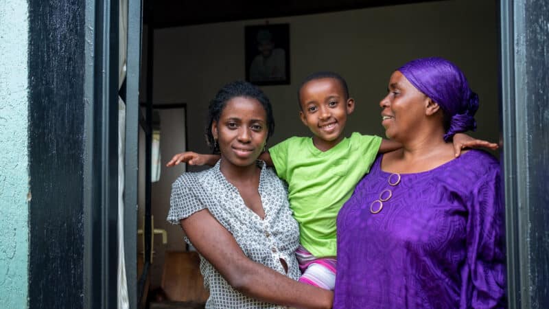
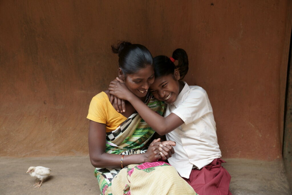
Were staff engaged? Very much so with the cause – putting in all the hours because of a belief in our ability to deliver for the children and families we’re here to help. Children like Sonia, who narrowly escaped ending up in an orphanage during the Covid crisis, thanks to the support of our local partner Child in Need Institute.
But not all staff were quite so engaged with the brand. Communicators and fundraisers sometimes had to reinvent the wheel, ignoring existing brand assets. Everyone recognised that if we could update our messaging and fix our website, we could save vital hours and give staff the confidence they needed to communicate our message clearly, consistently and compellingly, to launch our new strategy, reach more supporters and keep more children safe at home.
How to realise these opportunities?
I think it was the truth at the heart of who we are, that had somehow got lost in translation to our existing look and feel. The communications had moved away from the vibrant, passionate, knowledgeable crew, to look and sound a bit more like a bank-and one from the bad old days at that. There was a gap – a misalignment – between who we are and who we appeared to be. So that’s what we set about doing. Bridging the gap.
With a core team from all parts of the organisation, working in short sprints, we
- Agreed a common language to discover who we thought we were as an organisation, and how we might authentically articulate that to the world outside;
- Built a brand platform consisting of tonal values, brand story, key messaging, reasons to believe and elevator pitch;
- Designed a totally new look and feel;
- Thought deeply about changing our name and decided to park that;
- Spent hours showing colleagues what’s changed, why, and how what we’ve got now supports them better;
Luckily, as a small organisation with limited resources, although we’ve worked on this for several months, support from our many wonderful pro bono partners mean we’ve kept costs as light as a feather. We’re hugely grateful to eatbigfish, Hall & Partners, Huddle, The Brand Language Studio, and That Explains Things for supporting children everywhere to grow up in safe, loving families.
How language frames our identity
At our studio, we believe that more than any other ingredient, language has the power to transform an organisation. Working with Hope and Homes for Children reaffirmed our belief. Language helped Hope and Homes to understand who they truly are and what role they play in the world. It allowed the team there to demonstrate their passion and fight for the cause they believe in so deeply. And we’re sure soon it will enlighten more of the world about the harm caused by orphanages and their broken systems, and encourage more of us to help make the change that gets more children to where they belong – into loving families.
Rob Self-Pierson, Founder of The Brand Language Studio, who worked with us to define our tonal values and messaging
Mark, Julia and everyone we met at Hope and Homes is brilliant – smart, tireless, focused, so generous, selfless, and so loving. With language on their side, we’re absolutely sure Hope and Homes for Children will soon see its vision of a world in which children no longer suffer institutional care.
Being more challenger
As part of our rebrand, we had the pleasure of working with Toby Brown and his team from strategic consultancy firm eatbigfish. Here Toby describes why they chose to support us and help us shape a more ‘challenger’ brand narrative.
Hope and Homes for Children are that very rare kind of charity: one with concrete achievable objectives that it is making huge progress on, and against which even relatively small donations will make a clear and lasting difference.
We only choose one pro bono project a year; we wanted to help Hope and Homes for Children not simply because their passion to challenge injustice for children deserved a louder platform, but because we saw in them a natural Challenger – an organisation with clarity around the change they want to bring to the world, and a restless desire to drive this progress at a scale that far outstrips what their budget would suggest is possible.
Our role was to help their team better reflect this reality in their brand narrative – taking an often understandably complex narrative and finding common centres of gravity that would break through the noise of their audiences’ lives and do justice to the incredible work they do.
A task made all the simpler due to the passion and dedication of their team. We’re confident this next step for Hope and Homes brings the mission of global orphanage abolition that much closer, and are proud to have played a small part.”
Toby Brown, Strategy Director, eatbigfish (one of our pro bono partners in crime)
What next?
This is a global organisation. With staff and local partners in nine countries, there’s a fair amount of work to do localising and harmonising our brand. And yes, we do have some pressing matters to attend to, such as our response to the humanitarian crisis in Ukraine: Please do donate to our Ukraine Appeal to support our work in Ukraine, Moldova and Romania where we’re helping protect children and families, now – and in the aftermath of this brutal war).
I’ve titled this blog ‘becoming who we are’, because I think that’s the most accurate way I can describe this rebrand. We’ve gone through a process that’s forced us to learn, articulate and agree (with ourselves and others) who we are. For me that’s the essence of rebranding; re-aligning your organisation and the individuals who comprise it to its core truth, and making sure that shines through in everything you do.
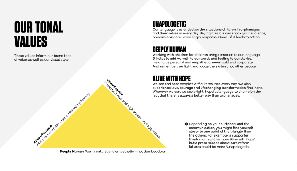
Not everyone loves yellow! Nor will we ever find a look and style that pleases everyone. But I hope you will agree, that the brand you see today, when you visit or speak to Hope and Homes for Children, is a pretty good mirror of who we are as a team; deeply human, unapologetic about children’s rights, and alive with hope.
Listen to Julia chat with Third Sector about our recent rebrand: Third Sector Podcast: Rebranding and reinvention
Read about our project in the chapter ‘V is for Voice’ in The Brand Language Studio’s new book ‘A-Z of Better Brand Language’
See Julia in discussion with our friends at eatbigfish